Overview
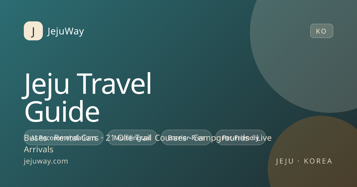
JejuWay is a travel companion for exploring Jeju Island — curated routes, hidden spots, and local recommendations, organized so travelers can build their own way instead of following a fixed itinerary.
Challenge
Travel content is abundant but fragmented. The product had to organize scattered local knowledge into browsable, trustworthy curation — and feel like Jeju, not like a generic travel aggregator.
Approach
We built the information architecture around routes and moments rather than listings. The visual identity draws from Jeju itself: ocean teals, basalt darks, and photography-forward layouts.
Scope of Work
Design System
Jeju's landscape as a palette — ocean teal, deep basalt, and cyan sky — with airy, photography-led layouts that let the island sell itself.
Color Palette
Jeju Teal
#14B8A6
Primary accent & navigation
Ocean Cyan
#06B6D4
Interactive highlights
Basalt
#134E4A
Depth & card surfaces
Deep Sea
#042F2E
Base background
Typography
Pretendard
UI & descriptions — clarity for on-the-go reading
Humanist Display
Place names & headers — a warm, guidebook voice
Design Principles
Place before interface
Photography and place identity lead every screen; chrome stays minimal.
Routes, not lists
Content is structured as journeys — how spots connect matters as much as the spots.
Trust through locality
Local voice and specific detail differentiate curation from aggregation.
Stack & Deliverables
Tech Stack
Deliverables
- Information architecture
- UI/UX design
- Frontend development
- Content structure
Links
Have a project in mind?
From web platforms to mobile apps and brand design — we can build it together.
Start a Conversation